Artist Trading Card with a background of newspaper from India and a Chinese fortune cookie fortune
I love the use of text as a design element. I know that a lot of other artists are also inspired by and incorporate text into their work. I adore the way Karen Stiehl Osborn uses text, Rayna Gillman does beautiful things with letters, and Virginia Spiegel has a way with words, just to name a few. I don't know whether my affinity for the use of all things alphabetical is linked to my colored-grapheme synesthesia or not but I do know that I find it a very satisfying inspiration.
Sometimes the forms of the letters are pure design elements for their shapes, used as background noise, as in this piece from my Climate series.

Sometimes the letters or numbers are large and central to the piece but don't "say" anything.

Sometimes the letters spell something relevant.

I can't get enough letters and numbers. I have over 600 fonts installed on my computer and subscribe to a bunch of font newsletters. You might say that I'm a font junkie. I'm such a letter nerd in fact that I print out and collect the Type Trading Cards from ITC (International Typeface Corporation) each month. They're like ATCs, but with font history and fun facts.
I also collect lots of things that have text on them to use in my work. I have scores of fortune cookie fortunes -

Maps - 
Old music scores - 
Pages from falling-apart books - 
Reproductions of old money or letters - 
Postage stamps - 
And of course, paper and stamps with other languages.
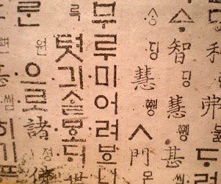
Handmade paper with Korean characters - 
A newspaper from India - 
And more alphabet stamp sets than you can shake a stick at - in every size from 1/4" to 3" high, and several character sets.
I've been playing with layering text of different scales, different languages, different colors, to say something and just for the forms. I can think of so many more directions to explore.

I found some really neat letters made of recycled tin cans in a catalog recently. The letters are about 8" high and 1.5" deep. Because they were on sale, the company was out of a lot of letters and only had two vowels left (u and o). It made spelling something out a little challenging, but I did think of a great word for my studio, as you can see!
My husband walked in right after I hung them up (probably attracted by the hammering) and wanted to know why the wall said "spout". Silly boy...

A girl after my own heart! I love every little detail.
ReplyDeleteGreat ATC's! For years now I have used handwritten words/text in my fabric. I love studying fonts too!
ReplyDeleteFulvia at www.fulviastudio.com
Hi, I've never posted on your blog but read it often. This is the perfect post for me to introduce myself as currently I'm all about text. I'm working on a series of quilts called The Poetry Series which includes my own handwriting of some original poetry. I just returned from a 5 day workshop with Claire Benn and Leslie Morgan that will further enhance what I'm doing. I'll post on my blog, Seamless Skin, later on in the week.
ReplyDeletePeace
cool stuff! i may have a few thing to add to your stash if you'd like...
ReplyDeleteWhat a great post! I wish I knew how to use letters; I always marvel at the work of those who do.
ReplyDelete